The Apartment – Ep 8 Leisurely Yours……

I didn’t know what to say.

The judges’s decision during elimination left me feeling…empty and disappointed. In the bottom two were The Opportunists and Glue & Glam. And the team who should have been sent home based on this challenge alone, got to stay. Something smells……

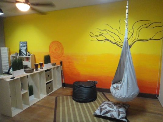
This week’s challenge was to transform the basement into a leisure room. The remaining four teams had a very awkward space to work with. On the one bigger side, they needed to create a home entertainment environment while on the other side, in a separate small room thats connected, they had to create a bar of some sort. And not forgetting the elevator shaft in the middle of everything. I would say, this would be the most challenging space to work on for me.

The twist? They had “belongings” that belonged to a mystery guest judge. The teams were handed out things from a handbag to heels to a dress. They had to use these items as inspiration and to make it all fit and look like they belong together. I thought they could have come up with a better challenge. (Has anyone seen Australia’s The Block?)

The Opportunist were given a dress that had a image of a painting. Something you could wear for tea. Perhaps high tea in an English garden. So clearly, you would do something like this, wouldn’t you?:

TO Leisure Room

THE OPPORTUNIST

I mean, seriously. WTH? Imagine watching The Lord of the Rings Trilogy in here. Now, put your chiropractor on speed dial. And don’t forget all the floral. (How could you? #inyourface) Floral carpet underneath floral chairs and floral dividers and (plastic) floral arrangements……..Quaint isn’t it?

Ok, so they were thrown off by the dress, they claimed. Let’s say we accept the (lame) excuse. The majority of their other rooms had asian influences and this room did not flow with the rest of the house. Just sayin’.

Now, because Glue & Glam were brought back mid competition, they had plenty of rooms to catch up on. Despite being advised to use the basement like everybody else, they decided to use the room that everyone had the kid’s room in. That could have proven their downfall. Design wise, it had a lot of potential. I thought they were so cool for putting up fibre optic starlight in the ceiling. You can’t see it in their pictures so it looks something like this:

fiber-optic-ceiling-newdelhi

A lot of hard work, I would imagine. Alas, that was the only thing I loved in that room. The rest of the room just did not live up to those lights.

GG Leisure Room

GLUE & GLAM

It looked more like a sleazy KTV bar. I was surprised that they paired “fish tank” lights along the wall with their amazing ceiling lights, cheapening the look. It looked very cold too, not at all welcoming. I guess I expected more from Mera and Kishz as I really liked some of their previous designs.

ELIMINATION

 I do get why Glue & Glam were eliminated. In my opinion, I think both teams should have been eliminated. But if  I had to pick one team only, I feel that Glue & Glam deserved to stay more, especially after Chelsea’s (The Opportunists) outburst in the judging room. Granted she has worked very hard and has had her fair share of frustrations, her attitude leaves much to be desired.

And I couldn’t bear to hear anymore of her nagging and complaining.

But it makes for good “reality” TV…….

WINNERS

Finally! A very well deserved win by Bros United. I was so impressed with the result of their hard work and genius. Armed with a computer and graphic design skills, they transformed the space elegantly:

BU Leisure Room

BROS UNITED

Frankly, I wouldn’t do anything differently because it is so freaking awesome! The colour combination and the movie star portraits just blew me away. Paula and I always thought they would be the ones to beat in this entire competition. All that is missing is a concession stand:

DIY_movie_concession_stand

Right. I’m starting to lose interest in the competition now but I still wish the top 3 teams all the best. Congratulations! Go for Veo!

The Apartment Ep 6 – Work or Wellness?

For this episode, the remaining teams of interior decor reality show, The Apartment had to choose between a study or a wellness room, with the design theme of sustainability. All teams except one chose study. Definite kudos to Glue & Glam for taking on a challenge that no one else did. Which would I have picked? I would have to consult my team mate Paula but I am going to share ideas for both.

WHAT I REALLY THINK

So the winner of the challenge were The Opportunist. Let’s take a look at their study:

Opportunist Study

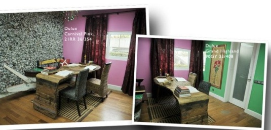
Our mentor judge, Jamie said that the newspaper wall (on the left) is one of the most memorable design features of the entire show.  I do get the concept of bunched up newspaper covering the entire wall like wallpaper. I also liked that they used an old recycled boat turned bench with the recycled wood table. However, I felt that the bench would have served better in a bigger space rather than tucked away in its existing corner.

Now, let’s talk about the other walls, shall we? That combo of pink and that yucky shade of green, complete with that gaudy maroon curtain, left me with one word: HIDEOUS.

INSPIRATION

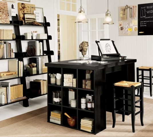
For me, a study needs to invoke inspiration and at the same time, clear the mind. To allow the creative juices to flow. It also needs to be bright and airy:

8-Wooden-Study-Room-Furniture-Design-by-Pbteen-550x550

This is great especially if you need to share the study. However, I would so go for this desk instead:

Industrial chic trunk desk

A total conversational piece!

I would pick neutral shades of (but not boring) colours for walls and allow the furnishings to bring out the character of the room. Here is a great example:

Ideal study

A harmonised combination of light and dark colours with a touch of colour. Even Fido likes it.

Need more clever storage ideas? Or perhaps a non conventional work desk? How about sitting a little higher:

Unconventional desk

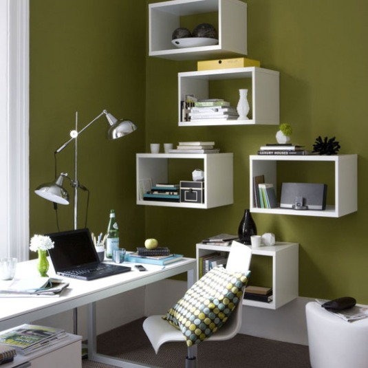
Ok, to be fair, the room space in The Apartment is not as big and not as bright. So how best to marry design and function and sustainability and yet keep to my own design brief? Perhaps something like this would work:

Doable simple modern study

I’ve still got my preferred colour palette. Its still bright and airy. I’ve got storage and art on my wall. And if you reuse some wooden planks to build these wall shelves, that’s sustainability.

WELLNESS

Right. What is Wellness? Is it exercise? or meditation? Maybe massages? Probably all encompassing. I would love to have a mirrored wall so that I can place my mat in front of it and practise pilates and or bust a few moves to Richard Simmon’s Disco Sweat. On the opposite wall, I would have a motivational mantra like so:

Motivation on a wall

Other than an exercise mat, it will also be equipped with a stability ball, resistance band and a nintendo Wii, for endless fun. Throw in a massage chair and meditative music, and I will be a new woman in no time.

The Apartment – Ep 5 Rub A Dub Dub

A quick recap on Ep 4 of The Apartment:

We were freakin’ eliminated!

But that will not stop me from sharing my design ideas for each room as the weeks go by. 😛

WHAT I THOUGHT OF THIS EPISODE

My favourite team for this challenge was The Strangers:

I absolutely loved that they did up the glass shower panels with Madonna song lyrics. Genius! What I wasn’t so excited about was that they tied with Glue & Glam for the top spot. Yes, I really liked what G&G did with the top part of the room. The black ceiling and the panels were gorgeous but I was majorly let down by the bamboo stumps all around the tub. They should have been penalised for it.

DESIGN CRITERIA

Right. Bathrooms can be tricky. As head judge, Laurence said, when using the bathroom in the mornings, it should invigorate. And when using it in the evenings, it should be relaxing. The theme given was ZEN and yet it still had to incorporate the overall theme of GLAMOUR. Now, what is zen? The word derives from the Japanese pronunciation of a chinese word, which in turn is derived from a sanskrit word that means ” Meditative State”. Here is Laurence’s take on Zen:

Wait a minute. Is he confusing it with Yin and Yang?

MY DREAM BATHROOM

I’ve got a check list for my ideal bathroom. Its probably the only space in the home where I know exactly what I want. It must have:

1) A Claw foot tub

2) Mosaic tiles

3) Bright and airy with windows

4) Shabby chic/rustic furnishings

5) A rubber ducky

I could soak in here for hours!

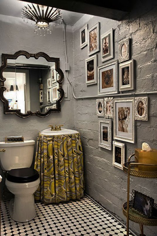
Given that the remaining teams had to finish TWO bathrooms, it proved too ambitious to hack and retile for some. I would most definitely try and tile the vanity area, to create a “feature”. Wish I could tile a larger surface such as this:

Maybe not quite zen but it is glamourous for sure.

Floor tiles might have also taken up too much time but competition aside, it can create an interesting visual and sometimes nostalgia.

This would look awesome under a claw foot tub

Loving the floor, the raw brick wall and photo gallery

SOMETHING LESS TIME CONSUMING

So let’s say we need to keep to the existing fixtures. No major hacking or changes but rather, a few additions to transform the space. I suggest looking at lighting, plants/flowers and little details like candles and pictures in frames, for that personal touch.

A beautiful orchid plant and stylised wall art makes the space elegantly zen. Adding a seashell also brings the outdoors in.

Bouncing light off mirrors create more light. Thus making the room brighter and yet cosier.

FINAL NOTE

So are my ideas zen? I am not sure they quite fall into the traditional zen catergory but I think as long as the space makes you go “Ahh……” or “Om…..”, that’s your zen.

I dare ya!

The Apartment Ep 3 – Safari Adventure

We wanted to win. We were determined and we were hungry. We have this challenge in the bag! Or so we hoped.

Well, we had grand ideas for the kids room. We were thinking something themed. Something for 2 young kids, like Paula’s boys, Garrett and Noah. So here are a couple that caught our eye:

Yeah, we were really liking the nautical theme.  And then, we were told we were getting “clients.”

What?! Clients? Actual people we would have to please?! Shooting Shishkabab! I had my fingers and toes crossed for a client who would be specific, know what he/she wants but not fussy. And we were blessed with…..

ALISTER!

is a fun and well mannered boy. He knew what kind of room he wanted. Safari, he said. Complete with a jeep. Hmm……

And he was specific about the colours he wanted. Green and brown. We suggested a sunset mural and he thought was a nice idea. A good start, I thought.

IDEAS

We had a gazillion grand ideas in our heads. Among them, we were gonna make a jeep bed and Paula came up with a space saving and yet fun bridge, which could be turned into a table as Alister got older. That was inspired by this:

Alister really liked the “No Girls Allowed” sign so we offered to make one for him. Oh boy, we had a lot on our plate at this point and the shopping list stretched from KL to Singapore. On the list were:

Wall decals

Straw (on thatched roof)

SHOPPING

was a pain. We could not find many things we wanted, like round lights for the jeep bed, more grown up looking wall decals, the right blinds…basically the majority on our list. We grabbed whatever we could, anything that was safari-ish and hoped it would all fall into place nicely.

WHAT YOU DIDN’T SEE

There was so much you didn’t get to see, I wouldn’t know where to start! We faced more uphill battles than any other challenge thus far. We had a big fight (long story) but we were still focused at the tasks at hand. The swing was a major time consuming project which involved a big hole in the (false) ceiling. Making the sign had a few more steps to it than I anticipated. Jamie came and gave us a few suggestions for the rope we bought. Great practical ideas that I wished we had time to incorporate into our design……

OUR SAFARI ADVENTURE

Other than our client, Alister’s wishes, we also had to adhere to the brief the judges gave us. The room had to simulate the mind, invoke imagination and be conducive for study and play. In addition, the room had to “grow” with Alister as he become boy to tween. We added details like:

Musical instruments in the Play Area – Perfect for boardgames with friends and a jam session with drums and a rainmaker.

A world map decal.

INSIDER ALERT: Erm….the world map was not to be as accurate as it should have been!

A study sanctuary with a calming shade of green

INSIDER ALERT: Do you recognise the bookshelf? It was the one we had built for the dining and kitchen challenge. Reuse, renew and recycle folks. Sustainability living is the new IN thing!

JUDGING AND RESULTS

I was so excited! I wasn’t sure about Paula but I was so sure we would win. I was proud of her mural, of our creation. I was so pleased that even our fight was worth it. But as the judges went through all our designs, nervousness started to set in.

This was us, the last 3 teams to be addressed (Bros United not pictured)

INSIDER ALERT: The last 3 teams meant one team was the winner and one team were to go home. Here, I was ready to hear our name as challenge winners.

Alas, it was not meant to be. When The Opportunists were named the winners, I was filled with so much disappointed and fear. Not only did we not win, we were now up for elimination?!  I was as stressed out as a blind folded knife thrower…….

Then the words, “Bros United, you are safe” reached my ears. I couldn’t think. I was so tense at this point. “Come on, Laurence, just spit it out”, I remember thinking. Just tell us we had to go hang our keys up.

He opened his mouth. And then the kicker. It was a non elimination round! We were still to be in the running to become Asia’s next top decorators! The relief was so intense:

So we fought tooth and nail. And we survived. We know we have to listen to the judges advice for our next challenge and not to get too ahead of ourselves. We know that Alister (and his mom) loved our room, like we did. And we hope you will too.

For more photos and ideas, join me on Pinterest.

Catch Episode 4 – The Garden Challenge on Starworld at 930pm on the 8th of Nov.

STILL GOT OUR KEYS! 😀

The Apartment Ep 2 – Let me entertain you

THE KITCHEN/DINING ROOM CHALLENGE!

When we were told we had to decorate our dining room to a special occasion, I immediately thought Christmas. And so did Paula. However, we then soon realised it might be really hard to source for christmasy decor when it was nowhere near the christmas season so we went for second best. Something fun, festive and colourful. And we could still get drunk at!  So we were excited for MARDI GRAS, baby!

FIRST THINGS FIRST

Before we could work on decorating for our “party”, we had to figure out what we wanted our dining space to convey. We wanted something bold and yet pleasing to the eye. And this caught our eye and ignited our imagination:

The colour scheme was bold and yet, elegantly simplistic. We were curious to find out if we could pull it off. When we went through our Dulux colour flipbook, I was so enthralled by a particular shade of blue named “Ship at Sea”. Which judge Laurence, affectionately known as LLB, said was “Fashionable”.

See? LLB is always right. Well, most of the time. (Monica, where are you?)

So Paula and I were really thrilled with our colour choices. Next we had to hunt down the perfect chairs and table. And this time we had to pay extra attention to lighting as well. So off to the shops we went. Paula brought my attention to a marble table, to which I wasn’t quite sure about. I preferred a rustic looking table, a wooden top like this one:

I wasn’t too crazy about these chairs so we looked at another combination:

This looked better but it didn’t shout glam or fab to me. Finally, I agreed with Paula on the marble top because it was something I wouldn’t have picked and the table had green chairs around it!

*DID YOU KNOW?* That another team picked the exact same marble table but used different chairs. Can you tell me which team?

Now with such a strong colour for the wall, I wanted a few conversational pieces to tone down the shock factor. We were in this one particular shop where everything we wanted were taken! By other teams, no less! Including the all white deers’ head which Bros United had reserved but luckily for us, there was another similar one. I really wanted two but I guess we had to make do with the one and we added some frames to go along with.

Finally, we moved on to the lights. Paula and I spent so much time searching high and low for suitable lights but most were really tacky or old fashioned. Then I spotted some moroccan lamps and convinced Paula that we should get three of them, even though only 2 were identical. On the spur of the moment, I told her to “trust me, I will make a cool multi level cluster with them”.

WHAT YOU DIDN’T GET TO SEE

When we got home, we started on the dining area first. The painting went smoothly and then it was time to put up the lights before we could place the table and chairs. But to my horror, I found out that the lamps were meant to be standing ones as the bulb was on the bottom and not at the top as I thought! So I gathered the STARK electricians and asked them if there was anything they could do to switch the position of the bulbs. And they said…………

No.

I panicked for a while. I mean this is the focal point of the room! The lighting had to be perfect and then….

INNOVATIVE TIP ALERT: So I asked them if they could instead hang the lamps upside down and extend the electrical wire through the back. And they said yes! Here is the result:

 You like?

Heart attack #2 happened when our deer head and picture frames failed to turn up. That meant our bright blue wall was going to be, just a freaking wall! So I came up with bright idea #2. To create a piece of avant-garde art using malleable wire. I had seen it at some art show and thought, I could just twist and turn wire into something cool and hang it on the wall. Long story short, I spent about 3 hours “creating” a ball of mess which wasn’t even 1/8 of the size it needed to be. 3 hours wasted. Paula is just too sweet for humoring me.

Plan B was an artsy looking bookshelf I designed and I had to get the carpenters to make one for me while I tried to make up for lost time by helping Paula with the rest of the table setting. Speaking of which, we didn’t think it was that hard to look for beads and other purple and green themed decorations. But holy moly, thank goodness Paula brought with her strings of pearls and she was kind enough to let us use them for decoration. We draped the pearls around the candelabras and ran the table runners across the short side, instead of along the long side. The end result was something like this:

Note: This photo was taken after judging so we kept the pearls and the flower/vases. Oh, and the footwear were not there before!

Heart attack #3 happened 5 mins before time was up. Because we were busy putting last minute touches to the kitchen and dining area, we didn’t have time to check on the carpenters but we did notice they were taking way too long. I ran to look for them because we needed that shelf up pronto. To my dismay, it had taken that long because they were building TWO shelves, instead of the ONE I asked for. (Note to self: Brush up on my bl**dy mandarin!) With only minutes to spare, we sprinted to the dining room and as fast as they could, measured, drilled and then before we could say Hole In The Wall, the whistle was blown and we were left with one hole and no shelf. They wouldn’t even let us clean up or clear the shelf away!

Can you spot the tiny white hole in the wall? Click on the photo to enlarge it.

PARTY ON!

Overall, I was really proud of our spaces, even if we were not able to complete them in time. We were safe once again but at this point, I really wanted to win a challenge. Kudos to The Strangers for deserving the win, by awesome design innovation! And special mention goes out to Bros United. I love their kitchen and dining room especially the signs (Libations and all) in the kitchen. Not forgetting their custom made dining table. Which I want to steal……..

*SIDE NOTE: Is it just me or is Killian kinda sexy when he’s working up a sweat?

I digress.

Don’t forget to watch the 3rd episode of The Apartment-Style Edition every Thursday on Starworld at 930pm. Reruns happen all weekend from Friday through to Sunday.

For more photos and other design inspiration, join me at Pinterest and Facebook.

Thank you so much for your support of me and Paula and together, we are the Design Divas.

The Apartment Premiere – Our Boudoir

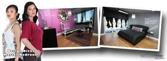
When I found out the first room we had to work on was the master bedroom, I was way excited. The brief was glamour and immediately in my mind, appeared a chandelier. Not a gaudy crystal one but something like this one:

Yes, I thought “Glam Rock” and luckily for me, I didn’t really have to convince my team mate Paula as she thought it was a great idea too! Next, we had to choose the colours we were going to use. And boy, did that stress me out, beacause Dulux had like over 2000 different colours and shades!

We settled on grey and pink as we wanted to go for something masculine and feminine. To create a balance like ying and yang. But glamourously!

DESIGN

We had a few ideas of what we needed to get but we were worried about the availability of such pieces and if we would actually have enough time to find these bespoke pieces. Here are some images to best describe our vision:

Love the bed especially the headboard

As shown here, the grey, pink and black works like a charm to create that baroque glam rock look

We liked the idea of using different “shades of grey” (wink)

Shopping

is always chaotic. With limited time and so much to explore, we were weighed down by a few obstacles.

1. The colour chart/wheel/book. Man, with that many options, those things were heavy! Because we had to make decisions on the go, we lugged it around with us, to make sure the furniture choices matched.

2. Never go shopping in a low cut maxi dress, especially when you are in a race against time. What was I thinking?! I was tripping over myself because clearly, my attempted big strides were met with restriction. And I had to constantly make sure the girls stayed inside the dress, which posed a huge challenge since I had to run around and carry bags of furnishings.

3. Other teams getting to the shop before you means they probably bought that one piece you really, really, really want. That happened to us at my favourite store, iwannagohome. Grrr…….

WORK IN PROGRESS

We finally got everything back to our new home. And with almost no time to spare, we got to work straight away.

Taping up before the painting. I wasted too much time doing this!

We decided to do the ceiling as well which also took a long time!

Paula had a “situation” while working on the ceiling. See for yourself here. Heehee….I promise she still looked great. (You worked it girl!) With the painting taking way too long, we were SO relieved to find out that we could hire handymen and painters from STARK to help finish up the rest of the painting and to put up the curtains and mirrors. We had a slight heart attack when one of the painters used the wrong colour on one of the walls. Paula and I were also left wondering why it took like 3 hours to drill holes and to put up the curtain rods. Another unnecessary set back. But we just kept going.

TADAH!

I present to you our bedroom. Ok, we didn’t know if we were suppose to include the balcony into our design or the extension near the walk-in so we choose the extension.

INSIDER ALERT: We were missing a silver beanbag chair that was meant to go in the corner on the right. We ran out of time!

This is Gary the Giraffe.

I love Gary. So does Paula. When I first set my eyes on him at iwannagohome, I was like, “Paula, we need to get this for Laurence!” Laurence, of course is our razor tongue but absolutely charming judge from London. The erm…stuff around Gary is from the supposedly strong tape we used to put him up. Again, because we had no time. And of course just before the judges came to visit, he was hanging fine. But when they came…ok, moving on.

INSIDER ALERT: We wanted to paint the gold mirror silver but couldn’t due to the lack of time (I sound like a broken record).

Lola (left), Simba (right)

Paula and I wanted to add as many personal details as we could so we used photos of my pets on “my side” of the bed. (I really want those frames!)

ELIMINATION

Finally, it was time to face the judges. Having watched countless eliminations on other reality shows, I was still unprepared for the experience myself. At this point, we had made some friends with some of the other teams and we didn’t want to see anyone go.

The Judging Courtroom (Yikes!)

This pretty much sums up my first experience at elimination. See? I told you Laurence IS charming.

 Well, we survived our first elimination with minimal injury to our ego and design ability. We look forward to our next design challenge and we thank you for supporting us. Go double Ds!

For more updates and photos, LIKE my Facebook page and my Pinterest for design inspiration.

Find Paula on her blog and to learn more about the show and the other contestants, visit the official website!

Catch the next episode tomorrow: 25th October, Thurs at 930pm on Starworld with reruns throughout the week.